Technologies plus fuel economy equals efficiency? — a Visualization Study
Overview
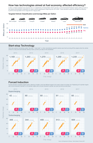
In 2012, the U.S. Department of Transportation (DOT) and the U.S. Environmental Protection Agency (EPA) built standards based on seven vehicle classifications (mini compact, sub compact, compact, 2 2-seater, midsize, large, and small pickup) for model years 2011-2016. These standards, promised to raise average fuel efficiency by 2016 to 35.5 miles per gallon (mpg) and increase fuel economy to 54.5 mpg by 2025. Since the auto industry has a wide range of technologies currently available to meet these standards, I wanted to answer the question, “How has technologies aimed at fuel economy affect efficiency?”
Methods
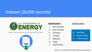
I downloaded the 2017 dataset from the US Department of Energy’s websites. The data contained in the file was updated as of February 02, 2017 for all 1984–2017 model years. With the recent file updates, newer calculations were used to estimate fuel economy. Therefore, it better reflected today's more fuel-efficient vehicles and advanced technologies such as hybrids and turbocharged engines.
I created a subset of data (Figure 1) to only look at 2012 and newer vehicles and filter them based on the seven vehicle classifications described by the Administration. After reviewing my initial findings, electrical vehicles created many outliers, therefore I redefined my data to concentrate on gasoline only vehicles with startstop, supercharging, and turbocharging technologies.
Findings
I provided my audience with historical information (Figure 2) about the standards and vehicle classifications. My graph used points to show historical information to the reader. I used Year as my independent variable and displaying both City and Highway average miles per gallon as my dependent variables. In addition, I call the reader's attention to 2011-2017 years by only showing labels and the 54.5 mpg benchmark.
Start-stop Technology
I gave my readers a definition of start-stop technology to give them them more detail and familiarity with the technology (Figure 3).
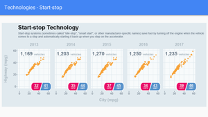
Since I was looking at yearly trends, I created scatterplots by year using the facet_wrap function in ggplot. This plotted gasoline powered vehicles’ average city and highway miles per gallon by year with start-stop technology. Additional information like total number of vehicle models and average city and highway mpg were added to show trends in the technology.
Forced Induction Technology
Being a car guy, I know a lot about forced induction technology and created two sub-sections to see which technology was creating greater efficiencies.
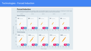
Again I gave my readers a definition of the technology (Figure 4), created scatterplots of city and highway mpg by year, and filtered the data by: supercharging and turbocharging. Similar attributes were added to allow the reader to compare all three technologies.
Discussion
Start and stop technology is more than likely making a difference in the consumer seeing overall city and highway efficiencies in the first five years of our goal of reaching 54.5 mpg.
Secondly, the ability to create more horsepower with a more fuel-efficient engine is being won by the turbocharging technology of forced induction, than supercharging.
Overall, no statistical significance was used against my observations to give the reader any greater confidence when choosing a vehicle with these technologies.
Documentation