Self Visualization — a Data Vizualization Study
Overview
Using a logbook, choose and monitor three or more variables. Using the collected data, tell a story about yourself using infographics and use the R/ggplot application to create your infographic.
Methods
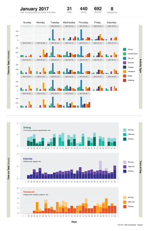
Over a four week period I created a Google Form to keep track of eight categories that I performed quite regularly: driving, creative work, day job, exercise, graduate classes, homework, meals, and meetings. I recorded these actions three times a day as to whether they we performed in the morning, afternoon and evening along with the time on task in minutes and mileage, if travel was required.
After 31 days, I had collected 692 entries, which was identified in to 8 categories, and equated into 440 hours of "stuff".
Since I wanted to look at a trend of information by day, I created an affordance of a calendar using the facet_wrap function in ggplot.
ggplot(myTime, aes(x=factor(ActivityType), y=TimeOnTask, fill=ActivityType)) + geom_bar(stat="identity") + ggtitle("Activity by Day") + labs(x="Activity Type by Days", y="Time on Task (minutes)") + facet_wrap(~DateOfActivity, nrow = 5) + scale_fill_manual(values=c("#16A085", "#2ECC71", "#2980B9", "#8E44AD", "#2C3E50","#F39C12","#D35400", "#C0392B"))
This feature created individual days and plotted the time on task for each category.

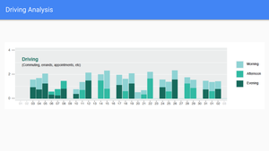
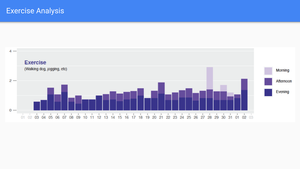
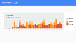
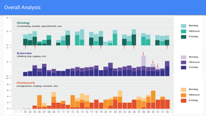
I plotted my three categories (driving, excerise, and homework) using barcharts. The charts visualized how much time was spent performing the tasks by time of day (morning, afternoon, & evening).
ggplot(data=myTime[myTime$ActivityType=='Commute',], aes(x=DateOfActivity, y=((TimeOnTask)/60), fill=factor(TimeOfDay, levels = c("Morning", "Afternoon", "Evening")))) + geom_bar(stat = "identity") + scale_fill_manual(values=c("#82DFDB", "#00BFA5", "#00695C")) + ggtitle("Commute by Time of Day") + labs(x="Activity Type by Days", y="Time on Task (hours)", fill="Time of Day") + scale_x_date(date_breaks = "1 day", date_minor_breaks = "1 day", date_labels = "%d") + scale_y_continuous(limits = c(0,10), breaks=seq(0, 10, 2)) + theme(panel.grid.minor.x=element_blank(), panel.grid.major.x=element_blank())
ggplot(data=myTime[myTime$ActivityType=='Exercise',], aes(x=DateOfActivity, y=((TimeOnTask)/60), fill=factor(TimeOfDay, levels = c("Morning", "Afternoon", "Evening")))) + geom_bar(stat = "identity") + scale_fill_manual(values=c("#D1C4E9", "#673AB7", "#311B92")) + ggtitle("Exercise by Time of Day") + labs(x="Activity Type by Days", y="Time on Task (hours)", fill="Time of Day") + scale_x_date(date_breaks = "1 day", date_minor_breaks = "1 day", date_labels = "%d") + scale_y_continuous(limits = c(0,10), breaks=seq(0, 10, 2)) + theme(panel.grid.minor.x=element_blank(), panel.grid.major.x=element_blank())
ggplot(data=myTime[myTime$ActivityType=='Homework',], aes(x=DateOfActivity, y=((TimeOnTask)/60), fill=factor(TimeOfDay, levels = c("Morning", "Afternoon", "Evening")))) + geom_bar(stat = "identity") + scale_fill_manual(values=c("#FFCC80", "#FF9800", "#E65100")) + ggtitle("Homework by Time of Day") + labs(x="Activity Type by Days", y="Time on Task (Hours)", fill="Time of Day") + scale_x_date(date_breaks = "1 day", date_minor_breaks = "1 day", date_labels = "%d") + scale_y_continuous(limits = c(0,10), breaks=seq(0, 10, 2)) + theme(panel.grid.minor.x=element_blank(), panel.grid.major.x=element_blank())
Discussions
In the end, my evening commutes are longer even though there is more traffic in the morning, I actually exercised in the morning three times, which is quite surprising, since I am typically not a morning person, and I spend much of my evenings and afternoons performing homework.
Documentation