Tour Like a Rock Star — a UX Case Study
Overview
With each visit to the iconic Rock and Roll Hall of Fame & Museum, I have been amazed at the sheer amount of artifacts, information, and space this venue encompasses. Wouldn’t it be great to have an awesome weekend experience, all while feeling like a rock star?
A museum experience has been seen as researching a website and selecting a hotel rate for a given day/weekend. A visitor purchases museum tickets, which get mailed, emailed, or printed. Upon arrival at the museum, spend a portion of your time looking at a paper map, and static exhibits with little to no interaction.
What if you could change that experience? Working in a team environment, my team members and I researched, sketched, and identified a process and created an app that allows visitors a "tour like a rock star" integrated experience at the Rock and Roll Hall of Fame.
Methods
Planning Stages (Research)
- Plan a weekend trip (similar features as Expedia, Travelocity, etc)
- Suggestions for lodging around the museum
- Hotel chains buy into the site/app to push special packages and rates to consumers
- Museum ticket may be part of the hotel package or purchased directly through the site/app
- Cleveland Visitor’s Bureau/Economic Development offices buy into the site/app, which help them market special events based on your visit dates (other things to see and do while you are in Cleveland)
Hotel/Museum Tour (Visit)
- Smartphone app is used to check-in to hotel and gain access to your room
- Smartphone app will be your personalized tour guide around the museum (headphones required)
- The app is your map of where to go and how to find the exhibits that you want to see
- The app interacts with museum exhibits through various technologies (photos, videos, selfies, virtual map, trivia, etc)
Afterwards (Reflections)
- Based on your museum experience the app suggests places for dining and nightlife
- Local businesses buy into the app, and suggest special dining experiences for museum patrons
- Create, reserve and confirm reservations
- Large venues or amphitheaters (e.g House of Blues, etc ) present special discounted events museum patrons
- Photos from your experience can be connected directly to an online marketplace (Shutterfly, etc) with special discount codes to get prints, merchandise, and photo books of your weekend experience
The team identified the touring system as "How To Live Like a Rock Star: Touring the Rock-n-Roll Hall of Fame." The system will provide an integrated experience to plan and book a trip, purchase tickets, check-ins, maximize the experience through tours and discounts, and create a lasting experience through recommendations to nearby events and memorabilia.
Interviews
We had created a contextual inquiry and personas that would identify key concepts of this case study. During subject selection we chose a wide age-range, who also had varied backgrounds regarding technology (some do not find it convenient and don’t prioritize its use, while others work in technology-driven positions and utilize it daily). We also ensured that each of our subjects had an interest in music, having attended at least one concert, and have at least one experience visiting a museum.
Modeling
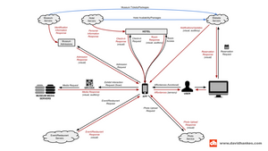
Flow Diagram
Focus Question: How can I tour like a rock star at the Rock and Roll Museum?
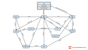
Concept Map
Focus Question: How can I tour like a rock star at the Rock and Roll Museum?
Conceptual Design
Card Sorting
Our group approached the card sort by selecting subjects who we used for our initial interviews. We felt that they did not have enough background of the project to be skewed, yet had enough of an introduction to who we are and felt comfortable being honest and open about their feedback. Half of our cardsorts were done using traditional paper cards, while the other half were done electronically using software.
All of the cardsorts were done as open cardsorts, allowing our subjects to describe their own “headings” for which they were grouping similar items. We did not influence our subjects in an way. Rather, we allowed them to independently make sorting decisions that they saw appropriate.
Task Scenarios
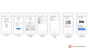
Booking Your Weekend - Website
You decide that you are going to visit the Rock-n-Roll Hall of Fame with your family. You visit the website and decide to book a weekend package and pay up front. You start the booking process by creating a profile that will survey your music/band preferences. The profile then recommends hotels, restaurants, and transportation based on your preferences. You select different options that fit in your price-range. After confirming your package, you are sent an email notification that provides a summary of your purchases and an itinerary, with a link to download the mobile app.
Questions:
- Looking at the homepage, what is your impression of the types of tasks you can perform using the website?
- Starting on the homepage, how would you begin planning your weekend?
- You don’t have a profile yet. Where do you navigate to next?
- How do you indicate that you would like to include hotel, transportation, and restaurants in your package?
- You want to splurge a little on your trip, but you don’t want to break the bank. Is there any way to ensure that your package will be within a certain price range?
- How do you select features of the package that you want and then book the package?
- You get an email confirmation of your package purchase. What do you expect to see on this screen?
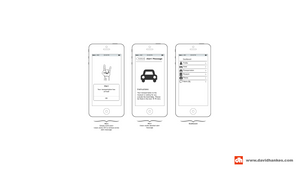
Touring the Museum - Mobile App
You are in Cleavland, Ohio, about to start your “Tour Like A Rock Star” weekend. You have already pre-booked your events and created a user profile. You arrive at the hotel and use your pre-downloaded application to check into the hotel and gain access into your room. In the morning, you receive an alert via the app that your limousine has arrived to take you to the museum. When you arrive, you click into your app to retrieve your ticket and get admitted into the museum. You are now ready to start touring the museum. Using the app, you follow the instructions to scan the QR code at the first exhibit, which narrates the exhibit in the voice of your favorite band’s lead singer. After the narrative finishes you take advantage of the options to view additional videos and listen to the artists music tracks. After a full day of museum touring, you are alerted that your limousine is outside to take your to your dinner arrangements.
Questions:
- How do you check into the hotel using your app?
- What do you do with your phone when you need to gain access to your hotel room?
- You decide that you want to review your profile. How do you navigate back to that screen?
- When the transportation alert appears on your phone, what do you do?
- When you arrive at the museum, how do you gain admittance?
- You are ready to begin enjoying the museum. When you walk up to the first exhibit you see a QR code and remember that you can use your app to listen to the audio tour. What do you do?
- After you see several exhibits, you decide that it would be fun to see a clip from your favorite artist’s first live concert. Check your app to see if you can find it.
- When you get back to your hotel your nostalgia pushes you to want to purchase a few tracks sung by your favorite artist. How do you purchase them using your app?
- Did the app exclude anything that you wished it would have included?
Measurements
- Number and type of errors the user committed per task (Per User evaluation type)
- This evaluation type had allowed us to gauge functionality, usability, and ease of navigation for the app. If the user was unable to navigate to different screens (or has to search extensively), it would have helped us determine how we could improve upon the design in the next iteration. The type of error would also point us towards whether the issue was due to visual presentation, content language, or concept.
- Number of times “help” is requested (Per User evaluation type)
- We did not believe it was necessary to have a “help” button, so it will be critical to count the number of times a user requests help or a help feature (not in understanding the task scenario, but rather in the actual navigation of the app/site). This is necessary to evaluate whether or not a “help” feature must be added in the next iteration.
- The number of users in the sample making a particular error (Aggregate User Evaluation Type)
- This evaluation type had allowed us to distinguish whether a user error warrants a design change in the next iteration. For example, some errors are “flukes” or instances of a user briefly making a mistake due to their own confusion, mishap, etc. However, similar errors by multiple users would show trends in poor design or functionality.
- The number of users completing the task successfully (Aggregate User evaluation type)
- This evaluation type would have given us a launching point for whether our design as a whole is highly erroneous or not. If most or all users are able to complete the tasks successfully, our attention will be focused on fine-tuning and fixing small errors. If most or all of the users are unable to complete the tasks successfully, it meant there was a large-scale design issue that we must evaluate from a high-level perspective. It also means we may need to continue through many more iterations and user evaluations.
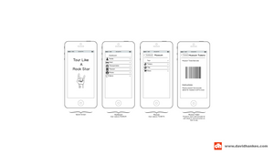
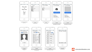
Protoyping & Evaluation
Discussions
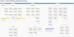
Contextual inquiry results, especially insights and insight clusters
- What to Improve: Foremost, we would have interviewed a more diverse group of subjects. The people we initially chose to interview were a somewhat diverse group but were mostly chosen by convenience. In retrospect, we should have interviewed foreign (non-American) visitors and visitors who were native to Cleveland. Foreign visitors would have been useful because they add different cultural protocols when booking a trip and visiting an attraction. Native Cleveland subjects would also be useful to interview because they would have a different expectation of how they want to experience the museum. Since the museum is always at their disposal they would likely be more interested in visiting revolving exhibits on a frequent basis. Non-native visitors, in contrast, are interested in staying at the museum for a lengthier period of time and wanting to view all exhibits.
- What Worked Best: The way we constructed our insight clusters was detailed and systematic in the approach. Given the interviews we conducted, our group did an excellent job parsing out the main focus ideas so as to have a launching point for beginning the design process. Our success in this arena was largely from asking the users specific, actionable questions about past experiences.
Requirements, personas, flow diagram, and concept map
- What to Improve: If we were to complete this process again, we would set ourselves up better for initially creating the Flow Diagram and Concept Map. Although they both were done impeccably in the end, there was a lot of working and re-working that went into it, because we did not properly prepare for their creation. This wasn’t because we didn’t do the necessary legwork for the diagram and map; rather, we did not yet have the insight as to how critical the conceptualizing and brainstorming was in preparing to create them.
- What Worked Best: Our Flow Diagram and Concept Map were strong points in our project. The organization was intuitive to the reader and helped guide us for the remainder of the project. There were several instances, when our group was working through the wireframes and prototypes, when we referenced our diagram and map so as to stay on track with the overall concept.
Focus scenarios, site map/information architecture, wireframes
- What to Improve: If we were to complete this process again, we would have standardized the card-sort more than we did. We should have decided ahead of time whether to use the same or different users from the Contextual Inquiry. Additionally, we should have only done the card-sorts with physical cards, rather than electronic cards. Doing some of the card-sorts electronically diminished the analytical process that was critical for the exercise. Lastly, although it was not required, it would have been helpful to do more card-sorts. Some of our findings were difficult to evaluate because the test population was small; if the population were larger, we would have seen more obvious trends.
- What Worked Best: Our wireframes were clean and complete. They were created with enough detail to launch us into creating our prototypes. Even though we could have included more detail to aid in the prototype design, we still did an excellent job on this part.
Low-fidelity prototype and usability evaluation
- What to Improve: If we were to complete this process again, we would evaluate more users. Similarly to how we felt with the card-sort, it was difficult to parse out large trends from our data. In many instances, it was tough to determine if an error was made due to a fluke (the user’s mind was elsewhere, he/she was nervous, he/she clicked incorrectly on accident, etc.) or whether the error was made due to a design flaw. Although we cannot control for the “flukes” even with a large sample size, a larger population would at least point us towards more specific trends in usability.
What Worked Best: Our Prototypes were very detailed and visually pleasing for our users. Watching users interact with the prototypes [fairly] easily proved our ability to create a comprehensive prototype.
Future Work
As a whole, the concept map and flow diagrams had proved to be the most valuable aspects of our design efforts. Because they were constructed in such a detailed way, they have provided the perfect launching point for our design plans. We have noticed how each step built upon the previous step in the project, which further illuminated the importance of being diligent throughout the entire process. The part of the process that was of the least value to our design efforts was translating the insights into insight clusters, because it seemed redundant. However, we had thought this was only because of the small amount of information we were organizing with the insight clusters. If this was a large-scale project with many moving parts, there would be a much greater need for condensing the insights.
The part of the process that was the greatest surprise was the results of our user evaluations at the end. Although users largely interacted the way we anticipated, we were still surprised by some of their interactions. Some of the website and app functions were intuitive to us from our perspective, but testing it on other users exhibited how differently people interact with an interface. While some parts seemed clear to our group, they were ambiguous to the user and needed refining. As far as challenges were concerned, we were able to overcome them on an as-needed basis by determining the point of contention and discussing it as a group. There were not many challenges, per-se, that arose, as much as parts of the process we would have done differently in retrospect (as detailed above).
Team Members
- Courtney Bregar
- Michelle Cruz
- David Hankes